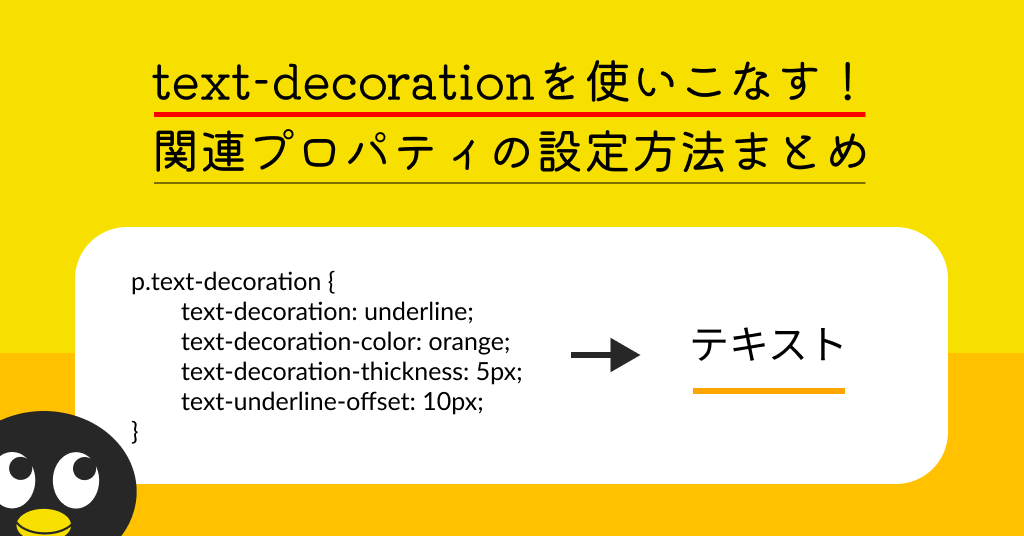
text-decorationを使いこなす!関連プロパティの設定方法まとめ
フロントエンドエンジニアのフジオカです。
突然ですが、HTMLで下線を引く際どういった方法で表示していますか?
自分は今までカスタマイズが簡単だから~とbefore・after属性を多用していました。
ところがどっこい、最近のCSSはもっともっと簡単になっていました。
とりあえず線を引くときに使っていた「text-decoration: underline;」が思っていたよりカスタマイズができるのです。いや今さらかーい!な感じもありますが備忘録も兼ねてこの感動を残します!
まずは基本の使い方
テキストに下線を引きたい要素に「text-decoration: underline;」を追加。
デフォルトでは下記のような感じですね、馴染みのある下線です。
p.text-demo {
    text-decoration: underline;
}
■表示例
下線を引いたテキスト
線の色を変える
文字の色はそのままに、線の色だけ変えるには「text-decoration-color: [変えたい色];」を追加。
これができるだけでだいぶ活用ができる可能性が増えますね。
p.text-demo_color {
    text-decoration: underline;
    /* 線の色を変える */
    text-decoration-color: orange;
}
■表示例
下線を引いたテキスト
線の引かれる場所を変える
線を上に付けたり真ん中に(打消しっぽく)したいときには「text-decoration-line: [overline/line-through/underline];」を追加。
「text-decoration:」で指定するときに大体「underline」って打つのであんまり使うことがないけども、「underline」の代わりに「overline」や「line-through」で指定することもできます。
p.text-demo_over {
    /* 線を上にする */
    text-decoration-line: overline;
    text-decoration-color: orange;
}

p.text-demo_through {
    /* 線を真ん中にする */
    text-decoration-line: line-through;
    text-decoration-color: orange;
}
■表示例
線を上に引いたテキスト
線を真ん中に引いたテキスト
線の種類を変える
線の種類を変えたい場合は「text-decoration-style: [solid/double/dotted/dashed/wavy];」を追加。
波線や点線の幅とか調整できたらもっと使用頻度は上がりそうです。
p.text-demo_solid {
    text-decoration: underline;
    text-decoration-color: orange;
    /* 一本線 */
    text-decoration-style: solid;
}
p.text-demo_double {
    text-decoration: underline;
    text-decoration-color: orange;
    /* 二重線 */
    text-decoration-style: double;
}
p.text-demo_dotted {
    text-decoration: underline;
    text-decoration-color: orange;
    /* ドット線 */
    text-decoration-style: dotted;
}
p.text-demo_dashed {
    text-decoration: underline;
    text-decoration-color: orange;
    /* 破線 */
    text-decoration-style: dashed;
}
p.text-demo_wavy {
    text-decoration: underline;
    text-decoration-color: orange;
    /* 波線 */
    text-decoration-style: wavy;
}
■表示例
一本線を引いたテキスト
二重線を引いたテキスト
ドット線を引いたテキスト
破線を引いたテキスト
波線を引いたテキスト
線の太さを変える
「text-decoration-thickness: [太さ];」を追加で太さも変えれます。
太さって変えれないものだとずっと思ってたヨ…。ちなみに「thickness」は日本語で「厚さ」です。
p.text-demo_thickness_5px {
    text-decoration: underline;
    text-decoration-color: orange;
    /* 線の太さ5px */
    text-decoration-thickness: 5px;
}
p.text-demo_thickness_1em {
    font-size: 16px;
    text-decoration: underline;
    text-decoration-color: orange;
    /* 線の太さ1em(1emはこの文字は16px) */
    text-decoration-offset: 1em;
}
■表示例
線の太さが5pxのテキスト
線の太さが1emのテキスト(1em=16px)
線の文字からの表示距離を変える
文字との距離だって調整できます。「text-underline-offset: [距離];」を追加しましょう。
位置まで自在ならもうbedore・after属性にしてpositionに頼る必要ないじゃん…!!
p.text-demo_offset_0px {
    text-decoration: underline;
    text-decoration-color: orange;
    /* 線と文字の距離0px(比較用) */
    text-underline-offset: 0px;
}
p.text-demo_offset_5px {
    text-decoration: underline;
    text-decoration-color: orange;
    /* 線と文字の距離5px */
    text-underline-offset: 5px;
}
p.text-demo_offset_1em {
    font-size: 16px;
    text-decoration: underline;
    text-decoration-color: orange;
    /* 線と文字の距離1em(1emはこの文字は16px) */
    text-underline-offset: 1em;
}
■表示例
線と文字の距離が0pxのテキスト
線と文字の距離が5pxのテキスト
線と文字の距離が1emのテキスト(1em=16px)
線と文字の重なりを調整する
これはbefore・after属性で追加した線だと一筋縄ではできない芸当。「text-decoration-skip-ink: [auto/none];」を追加します。
これは例を見てもらった方が早いのですが、英文のgやyとかのベースラインから下にはみ出る文字の重なり具合を調整できます。ベースライン基準なので日本語にはあまり意味がないです。
p.text-demo_skip_auto {
    text-decoration: underline;
    text-decoration-color: orange;
    /* 分かりやすいように線を2px、位置を-5px設定 */
    text-decoration-thickness: 2px;
    text-underline-offset: -5px;
    text-decoration-skip-ink: auto;
}
p.text-demo_skip_none {
    font-size: 16px;
    text-decoration: underline;
    text-decoration-color: orange;
    /* 分かりやすいように線を2px、位置を-5px設定 */
    text-decoration-thickness: 2px;
    text-underline-offset: -5px;
    text-decoration-skip-ink: none;
}
■表示例
線と文字が重ならないようになるテキスト yyyggg
線と文字が重なるテキスト yyyggg
デザインに合わせて適切なプロパティ値を!
ブラウザの互換性もほぼ大丈夫なので下線を引く際には取り入れていきたいな~と思いますが、デザインや動きを付けるという意味でbefore・after属性の方が使い勝手がいい時もあるので使いどころは考えていきたいところです。
これを知るまではtext-decorationはaタグの下線を消すのに「none」入れるばっかりだったのですが日の目が当たる回数が増えてきています。
互換性を考えつつも新しいプロパティとかは積極的に試していきたいですね!
参考サイト
https://developer.mozilla.org/ja/docs/Web/CSS/text-decoration-color
https://developer.mozilla.org/ja/docs/Web/CSS/text-decoration-line
https://developer.mozilla.org/ja/docs/Web/CSS/text-decoration-style
https://developer.mozilla.org/ja/docs/Web/CSS/text-decoration-thickness
https://developer.mozilla.org/ja/docs/Web/CSS/text-underline-offset
https://developer.mozilla.org/ja/docs/Web/CSS/text-decoration-skip-ink